Van Diemen Providore
Van Diemen Providore is a small family business in Kempton, Tasmania. They use premium Tasmanian produce to hand craft gourmet condiments. Their range is made using ingredients, wines and spirits to highlight the amazing produce in Tasmania.
The Brief: The clients goal is to become a Tasmanian Providore with a shop front, bakery, and distillery. They want to be thought of as a destination for an array of gourmet Tasmanian products and provide locals and tourists with a Tasmanian experience.
Ultimately they envision a providore with a bakery and distillery co- joined, where the products and condiments are made in house and are available in a seated setting or to be purchased to take home. With a open airy style decor, query music playing, maybe even a record player, a menu focused on seasonal produce and grazing plates etc.
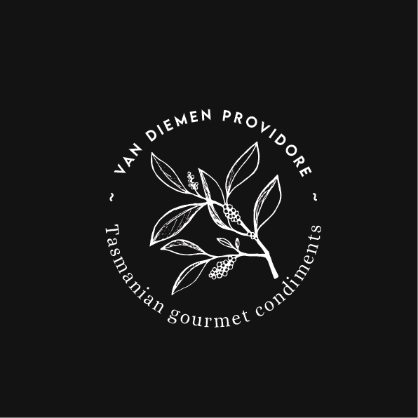
What I did: Their original logo featured the Tasmanian Pepper Berry (which people confuse for a dope leaf). The client originally had this logo because of its Tasmanian nature as well as that specific plant having a special memory of a loved one (who had a lot to do with the evolution & success of their business).
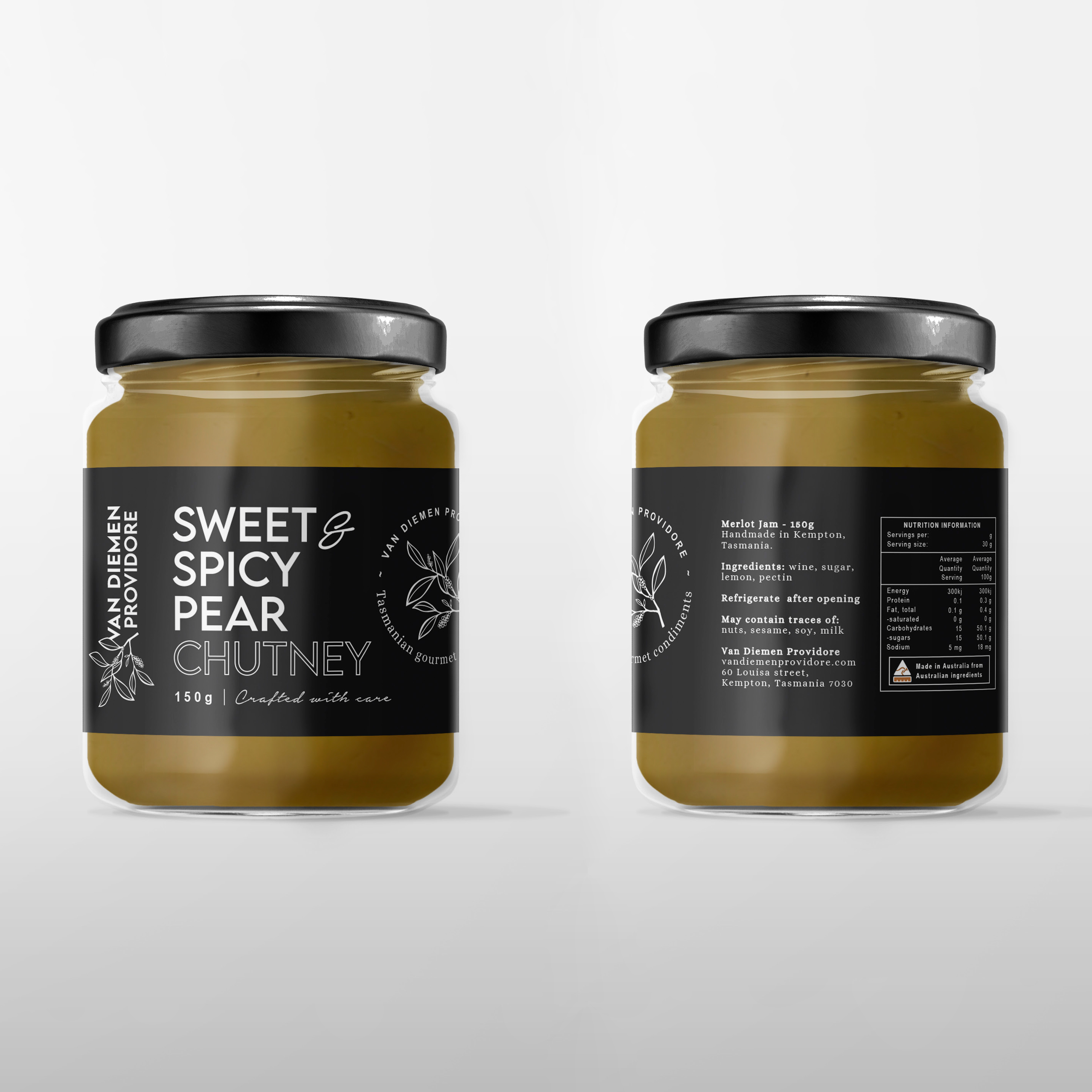
This meaningful icon was too special to do away with so I decided to give their logo a fresh look by updating the pepperberry icon. To give that feeling of homemade, I wanted the pepperberry icon to have an organic and textured look. Pairing the textured icon with clean & modern fonts, and sticking to a grey and white colour palette helps the logo convey that sense of gourmet in their products.


